
Shades of Grey has such cool movement and subtle contrast between all the different greys. I want to mix in some colorful solids. So I sketched two versions of a quilt design in EQ7 and I like them both... equally. Ack! Normally I'm a decisive girl. Especially when it comes to colors and fabrics. But I cannot pick which colors to use. I asked my family which ones they liked best and I got a split vote.
Would you help a girl out and vote for your favorite color combo?
|
|
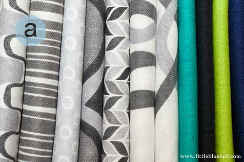 |
| Option a |
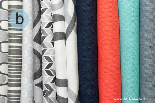 |
| Option b |
Maybe it would help to see the quilt sketches?
 |
| Option a |
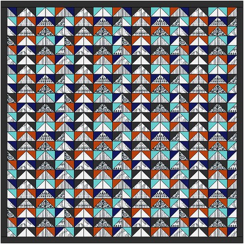 |
| Option b |
I'm not sure what size block to make yet. I need to play with a couple of ideas first and see what happens. There is so much to do this month! Did you see when Rita at Red Pepper Quilts used her Accuquilt to make flying geese? Maybe that would help move this project along. Have you used the 4 7/8" triangles combined with the 3" half square triangle dies? Do you recommend them?
Thanks for any and all advice you can toss my way!
-A
PS, the working title for this quilt is Grey Goose... *snicker*
Funny thing is I preferred the first one when I saw the fabric, but the second one looks better in the sketches so that's what I voted for.
ReplyDeleteI vote option B! I love the pop of the redish coraly color in that mix, looks wonderful! And the greys look beautiful too!
ReplyDeletegoodness!!! tough choice. I'd normally go with A, but those colors in B have lately been catching my eye.
ReplyDeleteI really like both - you can't go wrong no matter which you choose. I did vote for B though, because of the coral colour.
ReplyDeleteIt is hard to choose, but I did go for the "A" group. Why? With grays you really need that snap of color. The Teal and Lime green are perfect.
ReplyDeleteI prefer A after looking at the mock up.
ReplyDeleteAnd I have those dies. They make huge honking geese, so it would definitely speed your project along. I find making geese with die cut fabric about a zillion times easier than without -- they are super accurate and virtually no trimming involved.
Option B is lovely. Very traditional. My only concern is that the red overpowers the gorgeous greys, which kinda defeats the purpose. For this reason I'm going for Option A, that lime is zingy but not as pushy as the red. I look forward to seeing your progress!
ReplyDeleteKristy, I couldn't find your email, but I just had to tell you that I really liked your explanation. The red/coral *is* pushy and the lime *is* zingy. I hadn't thought of the colors in that way and it really makes a lot of sense. Thank you!
DeleteI picked the first group of fabrics, but when I scrolled down to see the sketches, I liked the second group better. I love the name Grey Goose. Makes me thirsty. :)
ReplyDeleteWhen I saw the first pictures, I really liked them both. But with the mockups , Option A came out singing. But then I have a hard time not falling for a great lime green!
ReplyDeleteLime green is one of my favorites, coral one of my least favorites. So it was easy. The sketch with coral also looks dark. The lime/aqua combo is lively!
ReplyDeleteThat looks like EQ7 to me! You are getting good!
ReplyDeleteI'm on team A! A Grey Goose quilt needs to have lime. Obviously.
ReplyDeleteOkay, you and are on the same wavelength! My daughter's having a baby boy in June, and I last week I pulled fabrics from my stash for a quilt- gray prints, white solid, and a bright teal for the binding and backing! I love just a hint of color with the gray and white...(Mine is just going to be a simple zigzag.) Can't wait to see your quilt in action!
ReplyDeleteI love option A - I like the way the lime interacts with the teal and navy. Love your quilt design!
ReplyDeleteI too love them both, totally depends on where you are going to show it....I think maybe the teal and lime if for a guys room
ReplyDeleteGreat color combos but I'll vote for Option A. I love the lime and navy.
ReplyDeleteI love the A fabrics and the B sketch, I think the 'red' in the sketch looks less bright and more orangey so perhaps with the fabrics you picked out I'd go with A but if you have a more orange toned solid then B!! Gosh I hope that makes sense!!
ReplyDeleteI love the A fabrics with the gray... I'm always willing to use a *pop* of lime! Very nice quilt design too - good work!
ReplyDeleteCoral
ReplyDeleteI really like A but B is my favourite
ReplyDeleteOh, wow, I hadn't really looked at kona coral before but that colour is awesome! And that's the bundle I voted for. I think the grey/lime/teal palette has been played out.
ReplyDelete